It all started
WITH THE WEBSITES.
The external-facing presence for Kansas Grain and Feed Association, Kansas Agri Business Retailers Association, Renew Kansas Biofuels Association and the Kansas Agri Business Expo needed a face lift. Something modern. Something unique. Something fresh. We set out to do just that. We researched and found a hungry start-up web design vendor who provided us the sandbox and allowed us to create the castles.
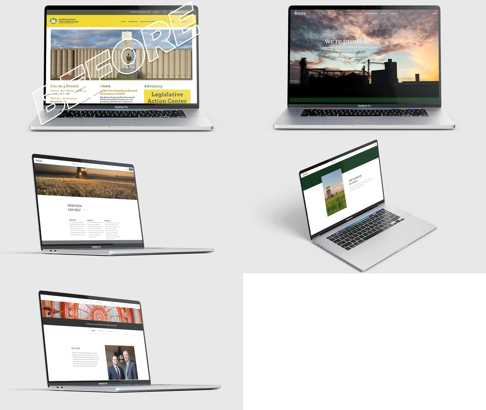
Kansas Grain and Feed Association
We wanted to effectively tell the story of our historic association and proudly show off what we do for our membership. As a business’ front door, we wanted the website to be bold, flashy and image-heavy to draw people in.
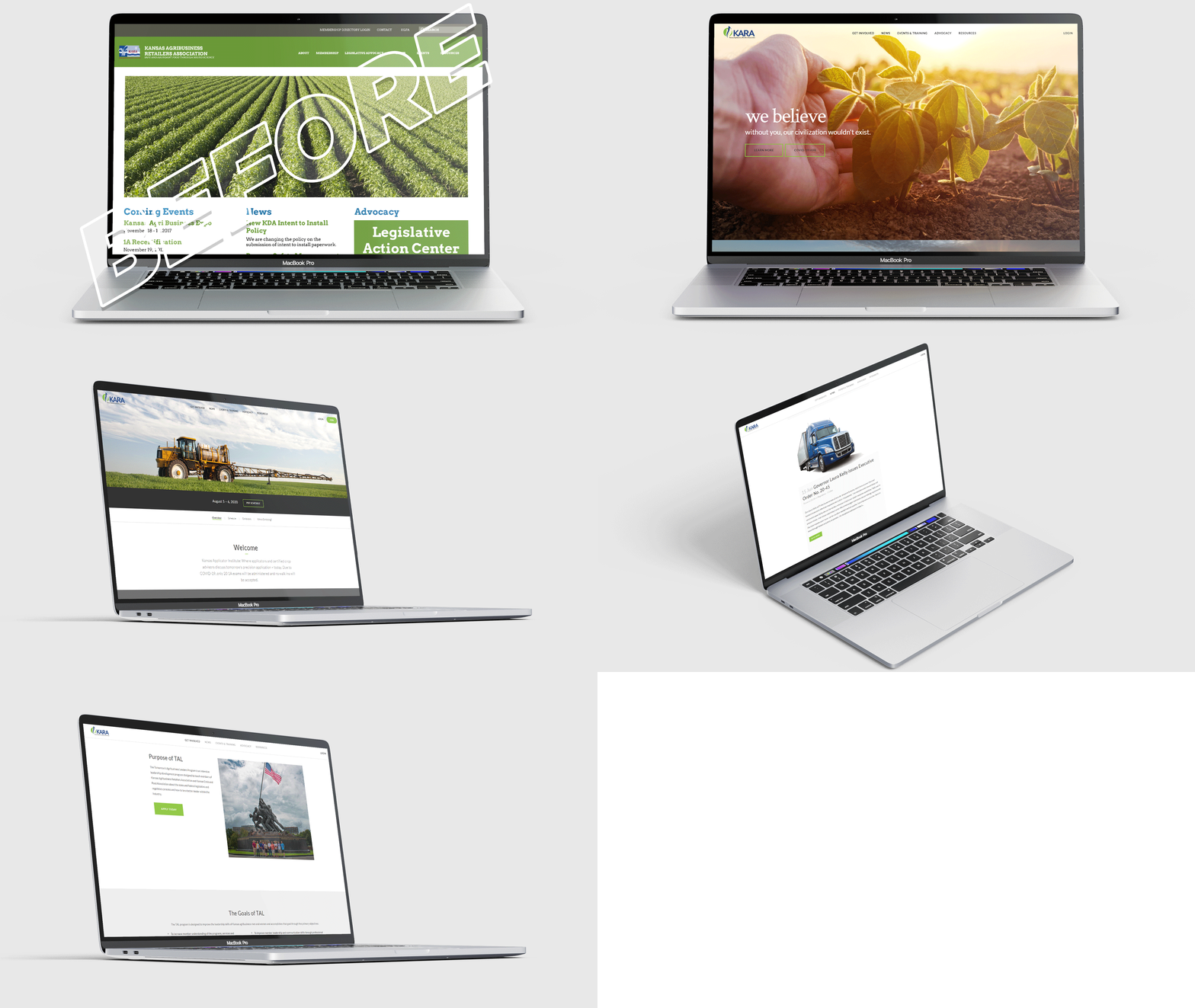
Kansas Agribusiness Retailers Association
Our goal was to create something modern and easily understood. A lot of people don’t know what it takes to grow crops that end up in the grocery stores. We set out to cast a positive image on the people behind the scenes of the farms who ensure a bountiful harvest each year.
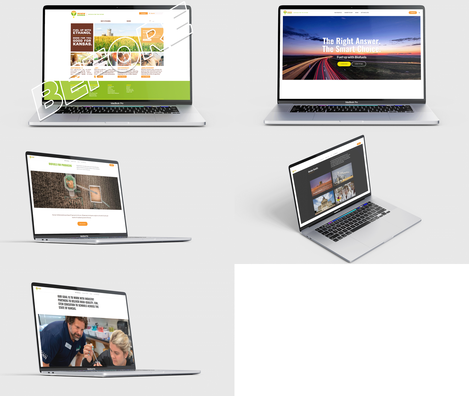
Renew Kansas
We hit our mark in providing our biofuel members a striking digital presence. With the goal in mind of increasing awareness of biofuels in general, as well as showcasing the work we did as an association, we implemented targeted functionality to this website including: benefits for consumers, environment, producers and the economy. We also incorporated a free, interactive map of biofuel locations across Kansas.
Selected Works
My favorite pieces from each of the redesigned websites. Some of the assets below I stylized and created, others were manufactured with a collaboration of my own vision and an outside sources expertise.
Where to Buy Biofuel
Aside from general awareness of biofuels for the average consumer, the Renew Kansas board of directors wanted to show people where they could fill up on biofuel. Without breaking the bank to create a map, we simply used Google and broke down each biofuel blending station for free and embedded it into the Renew Kansas website.
Join Us Today
As a dues-driven association, Kansas Agribusiness Retailers Association is all about membership. With the help of our vendor, we crafted a unique membership page spelling out each of the benefits organizations gain by joining.
Governing Documents
It may sound boring to a lot of people, but this specific page was one of my favorites to build. A 125-year-old association, Kansas Grain and Feed Association’s binding documents needed a place to be publicly displayed. Instead of a PDF or simply uploading a Word document we wanted to give it the special treatment it deserved with the ability to flow from one principle to the other.
Interactive Exhibits
We wanted to give exhibitors at the Kansas Agri Business Expo more bang for their buck than just 48 hours inside a trade show. We implemented an interactive map where attendees could go learn about exhibitors before, during and after the show was over.
Respecting History
Kansas Grain and Feed Association (KGFA) is an historic brand. Working with the designers on this project, we wanted to preserve the historical aspects of KGFA like the color and inclusion of the elevator. What we set out to portray was the awe-inspiring wonder the grain elevator has as it towers over the flattened Kansas plains. We wanted a perspective of the elevator being a strong, broad figure, and the effect of closing in on the structure and looking up at it from its base provided a brand-new take on the elevator in logos.
Showing Meaning
Kansas Agribusiness Retailers Association (KARA) is an association embodying growth. Its members sell the inputs farmers need to grow crops and feed the world. We wanted to symbolize the aspects of the crop protection industry with flowing artwork symbolizing water, fertilizer and other protectant products. The symbolism of growth can also be seen in the plant-like figure rising from the ground.
Working Together
The Kansas Agri Business Expo, the largest indoor agribusiness tradeshow in the midwest, is a joint tradeshow between the Kansas Grain and Feed Association and Kansas Agribusiness Retailers Association. With the aforementioned two receiving a refresh, it was only right to give the Expo a face-lift as well. We wanted to incorporate portions of both KGFA and KARA, but also pay special attention to our applicator exhibitors who contribute so much to the show annually.
Bringing it all together
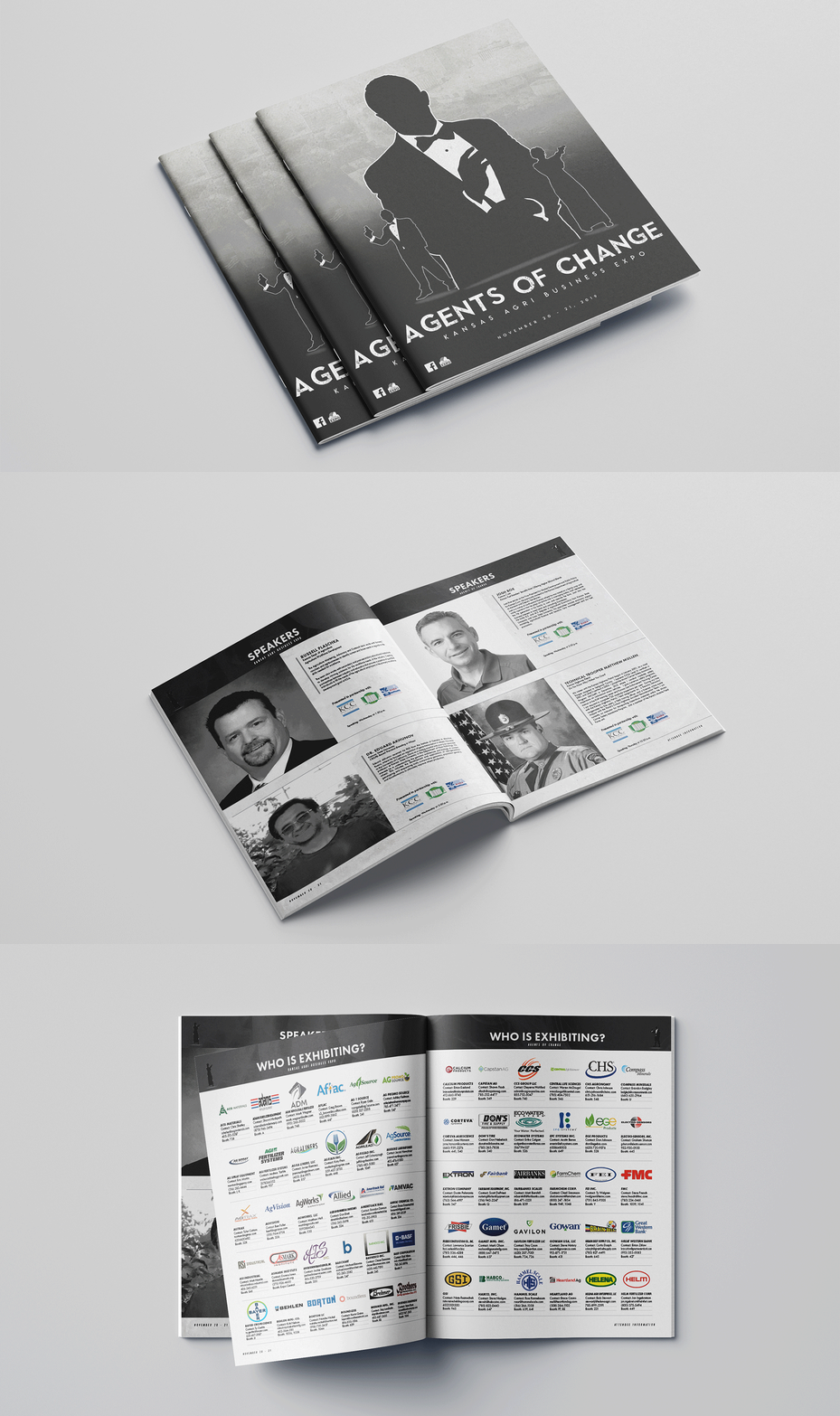
The Kansas Agri Business Expo is the largest indoor agribusiness tradeshow in the Midwest annually attracting more than 150 exhibitors and 1,100 attendees. This joint tradeshow coordinated by the Kansas Grain and Feed Association and Kansas Agribusiness Retailers Association incorporates a unifying theme each year. In 2019, we thought it would be fun to star in our own James Bond show leading to Agents of Change.
From Viewfinder …
After searching for a few days on stock photography websites, nothing seamlessly fit the look and feel we were aiming for with this project. After several hours of trial and error, wardrobe changes and memory card exchanges, two coworkers steadfastly stood-by as I made nearly 1,000 photos to find the perfect pose accompanied with the correct technical adjustments. As shown above, we settled on a few images and then I set to work in Adobe Photoshop bringing our Agents of Change theme to fruition.
… To Agents of Change
The entire campaign from start-to-finish was one of the most fulfilling professional experiences I’ve been fortunate to be a part of. From the very beginning of conceptualizing what we wanted the theme to be, designing and printing the programs, all the way to seeing the 95,000 square-foot tradeshow floor adorned with signage. We all thoroughly enjoyed the experience of, at least pretending, to be a little more suave than we actually are.
Thank you for your time.
I would love to chat with you. Please contact me!


